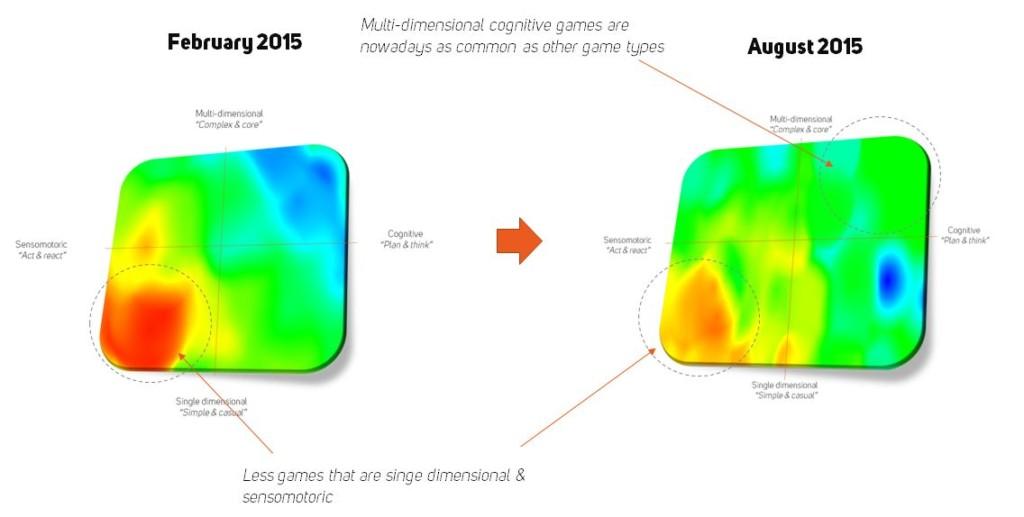
In Part I of this blog series, we discussed the problems stemming from the traditional (and quite inflexible) way of categorizing mobile games in today’s rapidly developing markets. As a solution to these problems, we introduced a more comprehensive way of sorting the over 300 000 inhabitants crowding the AppStore at the moment. This was done by locating your game along two spectrums based on the fundamental mechanics of your game and what it “teaches” to players.
These spectrums are:
1. Sensomotoric – Cognitive (doing things fast vs. doing things slowly)
2. Single-dimensional – Multi-dimensional (one core layer vs. many core layers)
When we combine these two spectrums, we get a more complete depiction of the mobile game universe:
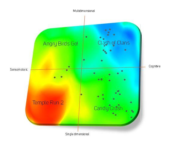
By locating your own game in this heat map, you will get a better understanding of not only your title’s competitive environment but also of your target audience and their preferences.
Now that we have introduced our way of looking at things, it’s time to dig deeper into our database and shed some light on what kind of features work especially well in sensomotoric games in today’s US iOS markets.
SENSOMOTORIC GAMES’ STATE TODAY
The left-hand side of the competitive heat map above consists of games with the main focus on aiming, reacting to changing situations, and/or steering and maneuvering.
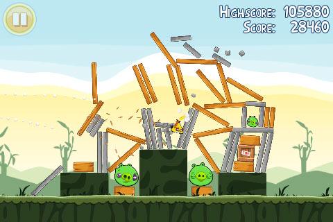
In single-dimensional ones, there is only one core layer or “task” to concentrate on, and you will find yourself going at it over and over again. Rovio’s Angry Birds and Kiloo’s Subway Surfers are fitting examples of this group. In multi-dimensional ones, you have more than one core layer, usually for increased depth and sense of progression. For example, in Hothead Games’ Kill Shot you are not only shooting people, but you must also buy new weapons and upgrade them in order to progress in the game.
If you glanced through the top-grossing 50 (and 100) list four or five years ago, there was quite a big bunch of sensomotoric titles celebrating in the limelight and making heaps of money. But the situation has changed a bit since those days. As the free2play revolution swooped down on us, it became harder for especially the single-dimensional sensomotoric games to make lots of money, as those games don’t usually have too many things lying around to be monetized. Moreover, keeping today’s fickle players engaged long enough has proven to be a really tricky task – something that slower-paced cognitive games seem to be better equipped to deal with.
So if you are going for the gold, should you stop making sensomotoric games altogether? The answer is simple: of course not! You just need to figure out the right recipe for your game to match the taste of today’s market and your focus group. For example, Crossy Roads has proved that you can still hit it big with simplistic sensomotoric games. Also, if we look a bit beyond the top-grossing 50, we can see that these fellows start to pop up more frequently. This shows us that the demand exists – you just need to stand out from the red ocean and create a game that appeals not only to you (and your friends) but also to your customers, the gamers.
4 WAYS TO INCREASE YOUR SENSOMOTORIC GAME’S CHANCES OF SUCCESS
So what are the ingredients sensomotoric games “must-have” in order to conquer the hearts and wallets of today’s gamers? Well, there’s no single feature, which makes or breaks a game all on its own, but these four market data based guidelines will improve your title’s chances of commercial success today:
1. Don’t Be Overprotective of Hard Currency
Hard currency is a clever way of disguising the fact that you are actually using real money to buy something in a game that was supposed to be free to play. Because hard currency is the main tool for reaching down to the wallets of the whales both big and small, many developers (and publishers) are usually REALLY protective of it. As a result, there are lots of games out there that don’t give out hard currency at all – you have to pay up for each nugget of gold and shard of diamond with real money.
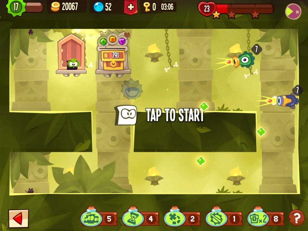
However, based on market data, you are better off loosening up a bit. By rewarding players with hard currency for the actual game-play (and not just for connecting to Facebook…), especially sensomotoric games’ chances of success in the top-grossing charts are improved. Leveling up, completing tough stages, and participating in social events like tournaments are good spots to give up a couple of those shiny gems – not too many, but just enough to make them hungry for more.
2. Surprise Your Audience with Non-Linear Level Progression
A never-ending string of levels reaching as far as your eyes can see, each with an exciting name like “23” or “341”. Sounds familiar? Many developers go with the rather easy choice of linear level progression when planning their game. I’m not saying there’s anything wrong with that, we have lots of examples that it can still work wonders. However, we have even more examples that it just might not.
Objective data from the markets points out that having some non-linearity in the sensomotoric game’s level progression helps to lift its commercial potential quite significantly. In the graph below, we can see that it’s actually a trait way more common to the success stories than the average joes’:
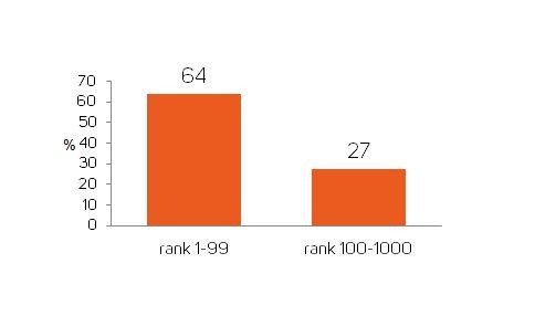
Moreover, the positive effect of non-linearity in the level progression is trending up, meaning that gamers today like to have some freedom when choosing what dungeon, track, or area to take on next. Keep in mind that you don’t have to say goodbyes to your well-honed world map with that super exciting singular string of levels – just add a couple of special stages departing from the main path to keep things fresh!
3. Increase the Sense of Advancement with Visual Progression
The last tip focuses on the visual aspects of sensomotoric games. Graphics and their appeal are a very subjective area – some of us like perfectly honed animation and extremely detailed static pictures, while others get that warm and fuzzy feeling while crossing roads in a coarse world of pixels the size of your head.
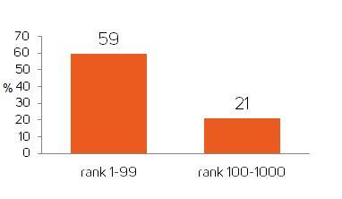
However, one thing can be backed up by actual objective data. When players are acquiring new items, buildings, and characters or upgrading them, they should be given visual cues of that progression. It doesn’t have to be anything too dramatic. A change of color in the corners of your collectible cards or a bit shinier bumper in your Batmobile is enough. The key is to give your audience a sense of progression and a reward they can see with their own eyes – and of course something to show off to their friends. If you just spent gallons of blood, sweat, and tears (or god forbid – money) getting that golden axe of ultimate destruction, it will make you feel better, when you can actually see your character swing it.

4. Keep Your Pool of Items and Characters Dynamic
As we look at market trends and the preferences of mobile gamers, it has become apparent that the hunger for new exciting twists and constant surprises wrapped around familiar core mechanics is growing. So if you have any kind of items or collectible characters in your game, you should be bringing out some new goodies once in a while to feed your hungry audience. What I mean here is that you shouldn’t carve your item and character assortment to a stone from the beginning, as being too static in this area hinders the possibilities of broadening your game’s universe. By having a merchant with changing inventory of goods or by constantly introducing new collectible characters as the player advances in the game, your target audience is more likely to keep on coming back to you. With improved retention, your title will have better chances against its rivals in the increasingly crowded AppStore.
That was it for the second part of this series. In the third and final part, we will be focusing on cognitive games and their current state in the markets. We will also reveal data-driven facts to help you in optimizing your own cognitive mobile game.

