In a previous blog post, we talked about how GameRefinery can show you how your competitors have been performing before and after implementing the same feature which you consider implementing in your own game. Now that you have committed to work on the new feature, I and Altti will next cover a couple of examples that will allow you as a UI designer to save a lot of time and effort in your daily routines.
You will be able to find direct references for your own projects, and all of this is driven by GameRefinery’s massive archive of +50 000 individual feature screenshots.
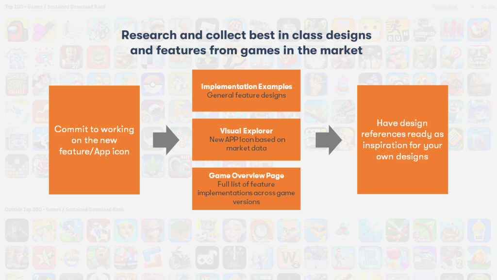
But what kind of tools should you utilize to achieve this? Let’s go through 3 core sources of valuable data:
- Visual Explorer
- Implementation Examples
- Game Overview pages
So, let’s dive into the potential use-cases for UI designing and utilize these tools along the way!
Atomize existing app icons in the market
With Visual Explorer, you can dissect app icons across the app store categories and GameRefinery’s own genre taxonomy. With this market data, you can see what driving attributes are, for example, for most downloaded games in your very own genre/sub-genre.
This allows you to save time in UI designing as you are able to guide your artistic decisions using up-to-date market data with a couple of clicks.
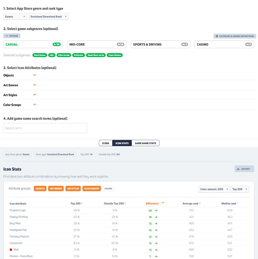
Here is an example of the most important attributes found in the top 200 downloaded Arcade genre games. This data helps you guide the requirements and give the art team instructions when you are creating the next six app icons for A/B testing.
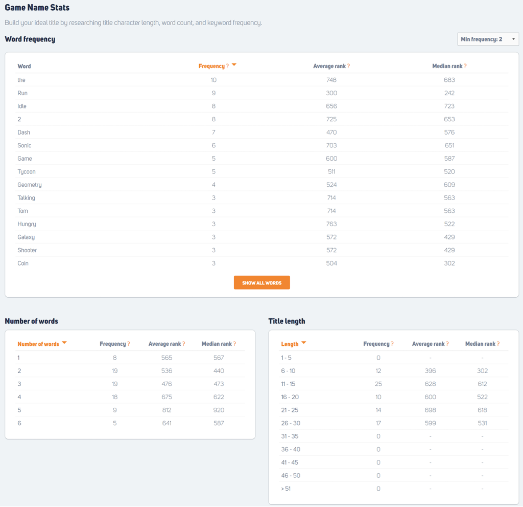
You’re not only limited to this, but you can also find the most popular words, amount of words, and title lengths in your search criteria.
Tired of spending a lot of time browsing through the internet for possibly good reference cases?
With just 3 clicks, you can find all the reference pictures of your top competitors’ games and how they have implemented your upcoming feature in their game. Implementation examples allow you to search through the +250 features by filtering them. From our massive database, you will find exactly what you are looking for, and needless to say, it saves a lot of your time.
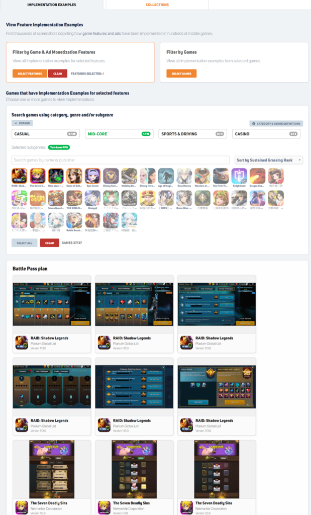
This example shows you how top 5 grossing RPG games have implemented their Battle Pass plans.
The cool part of all the implementations that you can find from our system is that you can create an unlimited amount of collection folders and add in as many screenshots as you wish. You can also create personal or team-wide collections for your upcoming features to have everything in the same place. This is a massive time saver for the communication between designers and UI designers.
Know your direct competitors
All the Game Overview pages include a full breakdown of the specific game: update history, app icon, feature, and implementation breakdowns. This gives you valuable information about how your core competitor(s) have implemented certain features in the games throughout the life cycles; this information you can utilize in your UI design.
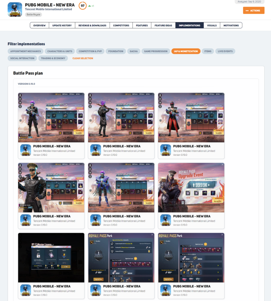
In this example, we are checking out how PUBG’s Battle Pass plan has evolved from the feature UI design perspective throughout the version numbers.
Would you like to learn more and see the service in action? Book a demo here!

