With the gaming market getting even more competitive, how can you make sure your mobile ad creative stands out from the crowd? In this blog post, GameAnalytics digs into 6 of the best ad creative strategies for advertising your mobile game.
Editor’s note: This post was originally published by Chay Hunter, Head of Marketing at GameAnalytics. With several years of digital marketing experience under his belt, Chay has a strong sense of what growth strategies work well in the mobile gaming industry.
In an increasingly competitive mobile games market, developers and studios vying for greater user traffic to their titles must pay closer attention to their User Acquisition (UA) strategies.
We’re seeing that even tried and tested processes that have gathered impressive numbers of new users in the past are now at risk of becoming ineffective. This is just as much due to overall market competition as it is to the increased automation and machine learning potential of platforms like Google and Facebook.
Essentially, automatic optimization of mobile ad creatives has made it harder for titles to differentiate themselves from competitors. And there now remains only a few ways to truly stand out from the crowd. From recognising the importance of original concepts to testing different ad formats, we dig deep into what the best creative strategies are for advertising your mobile game.
1. Do your research
Spying on your competitors is a basic principle for any project (even when creating your games), but getting this right isn’t something all mobile game developers have managed to perfect.
The ultimate goal is to identify gaps in the market, and understand what types of creatives are doing well.
Not only is this extremely important for identifying what other competitors are doing so that you don’t get left behind, but it can also offer some much needed inspiration when it comes to winning concepts and variations.
Look on Facebook and Twitter
Thankfully, recent changes to privacy and transparency policies by companies like Twitter and Facebook have made it even easier to carry out this kind of competitor research.
To see your competitors current ad campaigns, simply search the brand company or product you are researching and click on ‘Info and Ads’ in the Facebook dashboard. For Twitter, navigate to a specific brand under the Twitter Ads Transparency option to gather some essential data.
Build a Library
Not that we don’t want to encourage stalkerish behaviours, but it’s a good idea to collect your market findings into a library. As well as capturing a visual sense of the creative marketplace as a whole, you should use this as a place to store information on conversion rates and visitor behaviour. This will give your user acquisition team a good industry benchmark when it comes to the performance of creative types.
2. Understand concepts vs. variations
Before you get your hands dirty and start creating and tweaking your ads, it’s important to get back to the basics. The first thing you need to know when testing your output is the difference between concepts and variations.
Concepts
Concepts are the ideas or angles behind your creative adverts. This usually includes innovative layout formats, designs, themes or compositions that have not yet been explored before in relation to your title. It’s best that you test around 8 or so concepts before moving on to experimenting with variations.
It’s important you remember that big changes ultimately lead to bigger impacts on your traffic. If you have a fresh new game that needs advertising, or you’re looking to create some noise around one of your existing titles, then make sure to fully review the concept behind your campaign.
Tip: Try thinking outside the box, and do all you can to keep your approach to creative strategy fresh and far away from ‘tunnel vision’.
Variations
Once you’ve chosen your winning concept, explore different variations to further optimise your ad performance. A good variation can improve the impact of your ad as well as offer it a new lease of life as it starts to fatigue.
Variations include modifications of colour, image replacements, or even changes to the video lengths. What’s great about variations is that you can easily test and refresh your creative concepts, without putting in too much leg work.
Tip: You can squeeze the most out of your creatives by implementing a strategy of variation testing that can soften performance decrease and increase the over lifespan of your ads.
3. Know the difference: stills vs. videos
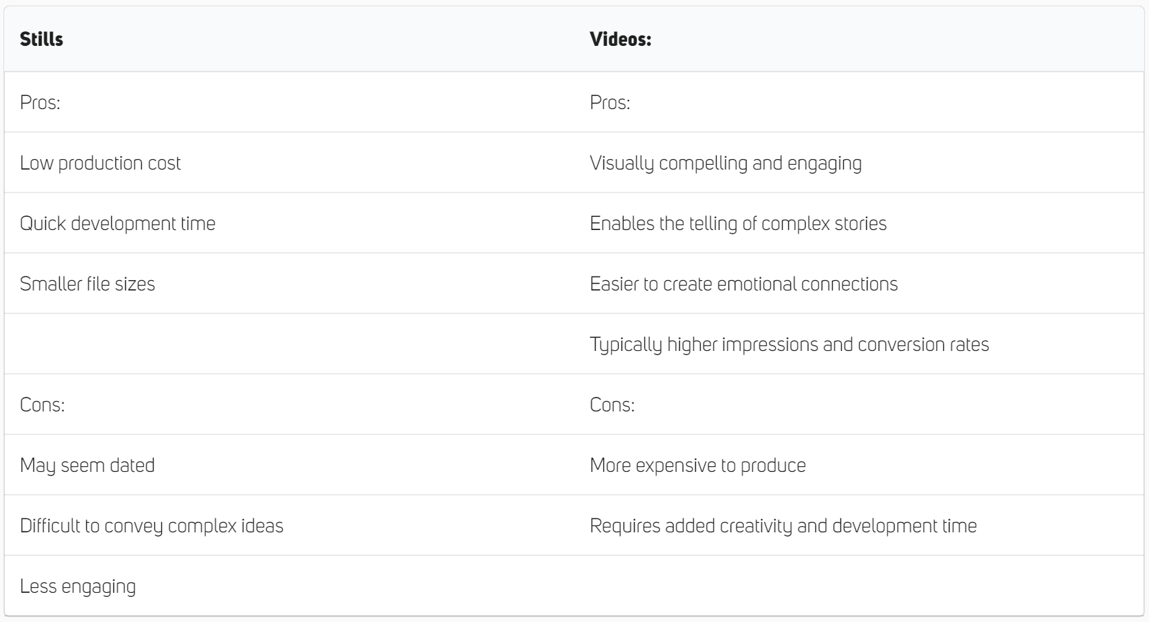
Most of the industry now favours video content when it comes to creative ads. Whether it’s because of typically higher click through rates or the need to keep up with competitors with stimulating visuals, videos have really become the standard across the industry. But is there still a place for static creative ad work?

Stills
Despite the overall trend, there are still ways to find success with static creative ads, depending on your situation and the platforms you are trying to target.
Firstly, non-animated stills will come at a much lower production cost and often a low CPC. When the creative marketplace is moving so rapidly, it’s good to have a set of assets that are easy to churn out and amend, with possibilities for lots of different variations.
Video
Video based creative adverts come in all shapes and sizes, and due to its effectiveness to deliver a more sensory filled experience for deeper engagement, it has become the most popular format used today.
A strong creative video ad can tell your story in complex detail much more effectively than a still advert alone. Conveying moods, feelings, perspectives and much more with greater impact, videos can also deliver emotionally ‘sticky’ experiences that work well to engage users and bring them to your platform.
Video ads include a range of different formats including animated promotional displays or interactive gameplay. Here’s an overview of each type of video ad according to Facebook’s review of hundreds of top performing video ads.

What’s right for you?
Every project is unique. Unless you’re as well known in the gaming community as Candy Crush and can afford to have a brand focused advert, you’ll most likely find yourself using demo in motion. This is the best way for your user to immediately understand the overall theme of the game, and what it’s about.
If your budget and time is tight, then combining basic motion and demo in motion is a good way to go (depending on the complexity of your game). Incorporating still images and simple animations to show how your game will work can save you a lot of time and money, as well as allowing you to easily experiment with multiple variations.
Whether you’re working with a publisher or user acquisition partner who takes care of creative ad work, or developing your ads in house, always consider things like your target audience, budget, target channels and most importantly, how you wish to convey your mobile game.
4. Tell a story – the purpose of your ad
Mobile games are like any other brand or commercial product in that they all have their own story to tell. The ability to tell this story effectively is what will separate you from your competition.
Among the essentials, your ad should inform your audience of exactly what kind of experience they’ll be getting if they download your game. This is arguably why demo in motion (or even basic motion) is the most popular of formats for advertising campaigns.
There’s nothing more frustrating for a gamer that downloads a game, than finding out their choice was based on a misconception.

5. Prep for Creative Testing
Whether you’re working with an in-house team of ad developers, or coordinating with external game development websites and UA experts, it’s important to lay the groundwork for effective creative production.
To have a great creative development process, you’ll first need to have a firm grasp of some core elements:
Who you are
No need to get existential here, but figure out who you are and what kind of voice you want to have as a developer, studio or product. This will really help you connect with users.
Brand Assets
Your brand assets are made up of a collection of guidelines, visual styles, colours and layouts that define you as a brand. Understanding what these are will help to create better mobile ad creatives and save tonnes of time when it comes to briefing external creative developers.
Campaign references
Tracking your ad performance and processing your data with game analytics to inform future creatives is an obvious one here. Use your results from previous campaigns to create a framework for what may or may not work when conveying your brand assets.
Brand mood
Moods can be designed and modified with a number of different elements. Consider what kind of backgrounds, textures and graphics are effective at creating your desired mood.
Inspiration
Whether this is ideas gathered from competitor research or simply videos and visuals that your team loves, inspiration is a great way to develop winning concepts that drive your creative campaign forward.
Likes and dislikes
Finally, make a record of the various aspects of creative ad work that receive approval. This includes preferred colour pallets as well as the style of graphic elements.
6. Test your ad Creatives
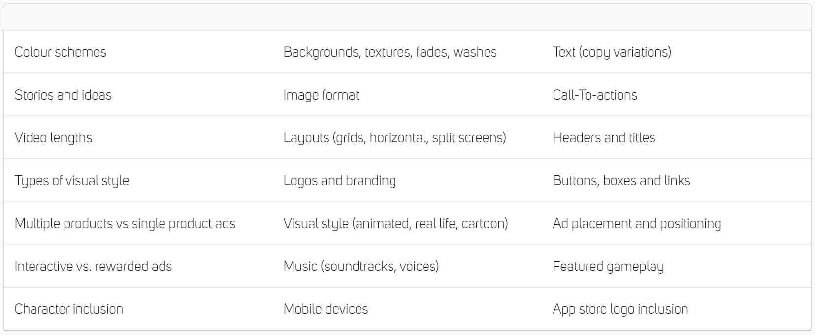
Everything eventually boils down to testing and player analytics when it comes to figuring out how good your ads are. In addition to broad brand assets, several elements of an ad can be tested to measure performance. Here are some of the key elements you can consider tinkering with to find the best output for your campaign.

By experimenting with different combinations within your ad structure, you can build up knowledge about what works and what doesn’t. Tracking the performance of a certain concept versus another is a good starting point for factoring in smaller variations into your creative work.
Any of the above features are a good place to start when you’re testing different variations of your ads. But make sure not to overcomplicate the situation. Choose only one feature to test at a time across different ads, and monitor which one is successful. Remember – you should be comparing apples to apples, not apples to pears.
Once you’ve found a winner, don’t stop testing! As we’ve mentioned, creatives have a finite shelf life and will always fatigue eventually. Track the performance of your ads to determine how they are favouring in the creative marketplace, and be ready to adapt and change if game metrics are falling short of where you need them to be.
Remember…
Going beyond generic and dull adverts is essential for titles looking for success with their user acquisition strategy. As the market gets more competitive and tedious, advertisers alike will need to be more creative in their approach to their ads in order to stand out.
The challenge for staying creative is keeping ideas fresh and engaging, as well as developing content at a rate that keeps up with the high churn of ad work out there. Those who are complacent in this area will surely see a drop in new user traffic to their titles and player analytics, so beware the consequences of sticking to your old formulas.
Ultimately, a large volume of quality ads is needed to sustain ROI and reduce the impact of ad fatigue, keeping your audience engaged. Now more than ever, creative ad work has become the defining factor of a strong mobile game marketing campaign.


